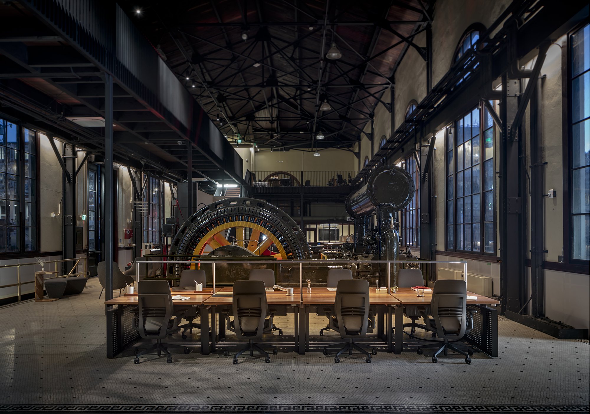
One of Pair’s central beliefs is in the power of customization to transform a space. That’s why all our core pieces come with flexibility built in through a range of options in shapes, materials, colors, and more. So when a client approached us to develop benching solutions for a dark, industrial space, we were ready to push the boundaries of our Mix desks to fit the space’s moody vibe. Plus, the client’s specific needs allowed us to reach for what our in-house design team call the “sweet spot”—where we conceptualize one or two bespoke tweaks to our off-the-shelf items to create something site specific and distinctive for that client alone.
Hitting the sweet spot
Our client’s large industrial building still had its original machines in the space, which looked incredible in low light that showcased its raw factory bones. Fleshing out the look presented our designers with two one-of-a-kind challenges.
First, we originally thought we’d have to develop totally custom workstations that visually accentuated the space’s unique feel. After several iterations, sketches, and client conversations, we came to the conclusion that our existing Mix workstation was the best solution as a base element instead of building a completely custom option. Since Mix is built on a kit of parts, we would still be able to personalize enough elements to create a unique look while saving the client money and time on a totally custom build.
Second, we needed to come up with an approach to lighting that would provide enough light for employees to work at their desks, without illuminating too much of the rest of the space. This called for a custom solution, incorporating minimalist light fixtures we designed ourselves that formed a central spine between desks. The result? A potent brew of 95% off-the-shelf items and 5% customized solutions—our “sweet spot” formula, ready to work its magic.
Iterating, rendering, and evolving
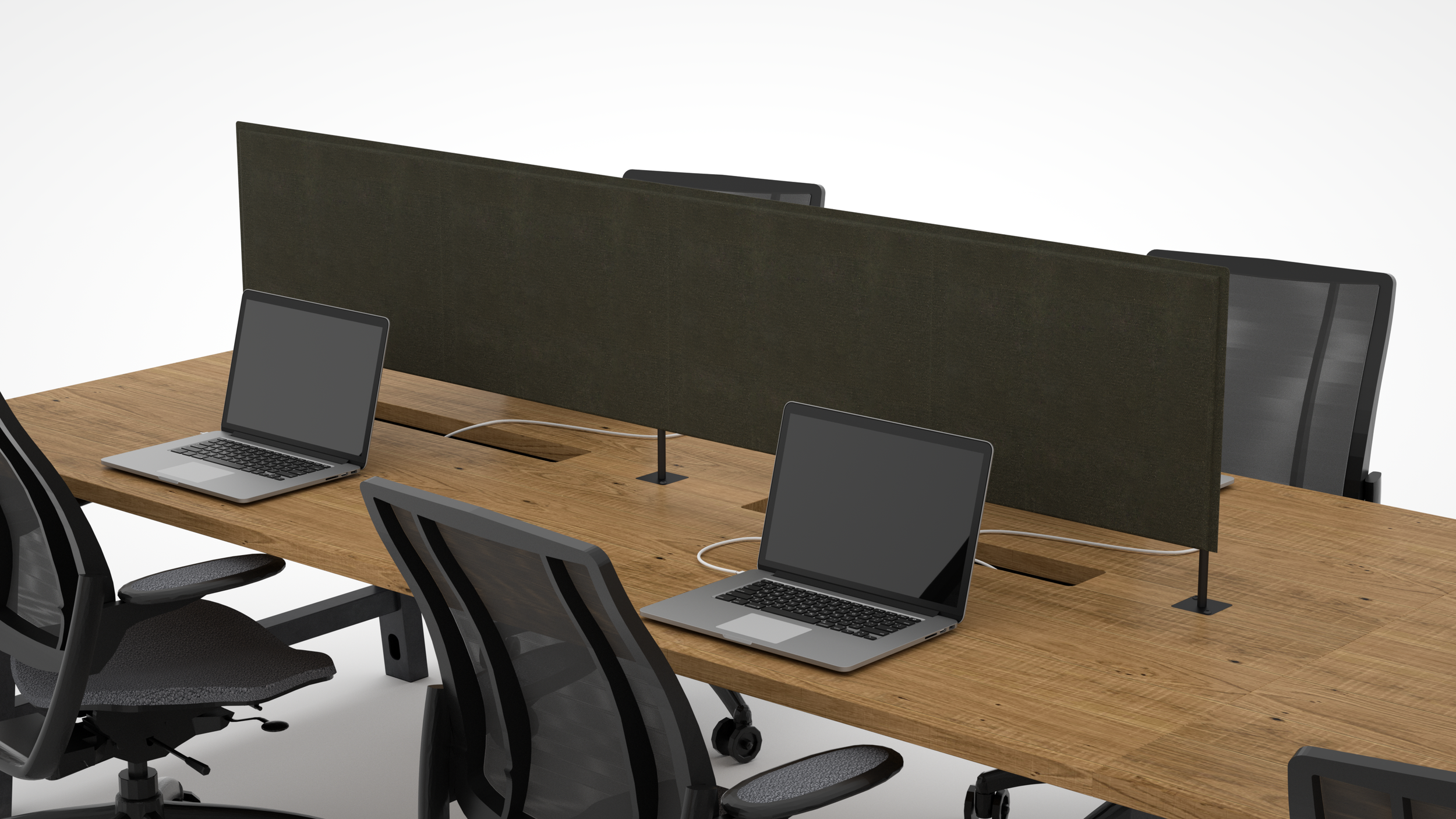
From the get-go, our designers were enthusiastic about matching the gritty, dark aesthetic of the client’s space. We dreamed up many possible design ideas, rendering each new iteration for input from the client to craft a truly collaborative process. These rapid rounds of iterations also saved us a lot of time, since rendering possible design outcomes is a much faster process than attempting to engineer each new idea in full. During this stage, we explored a range of options for lighting, some of which you can see below.
As the process evolved, so did our client’s thinking about the space. They’d originally requested shared surface workstations to allow hot desking, which would’ve required us to create fully customized desks based around a huge central panel. However, as we developed and rendered possible solutions using a custom surface as a base, the conversation shifted to individual desks grouped into clusters. We knew Mix, with its flexibility and height-adjustable desks, would be a great fit for this scenario, so the idea of Mix clusters divided by a central spine incorporating lighting emerged.
Shown here is a lighting study from the early stages of design ideation, with minimal off-the-shelf components. The desk surface, lighting posts, support, and integration would all have been completely tailored to the client.
We also explored using screens to enhance privacy, which we customized here to be the width of two users’ workspaces, rather than just one. The screens are raised on stanchions to allow access to the power system, conceptualized as residing in the cavities below the screens.
In this image, we’d reached the point of integrating the light in its final center-beam form and were ironing out final design details. We tested out an array of styles for the end legs, including this variation with a metal finish, inspired by the machinery in the space.
Here’s the design we opted for in the end: a traditional Mix base with custom perforated panels installed at the ends and custom lighting integrated along a central spine. The panels would be welded into our existing loop legs to create a look that moved beyond our standard portfolio of leg profiles.
Choosing Mix as the base element
After the client’s original ask, it took many design iterations to arrive at Mix as the foundation for the workstations. So how did we start with a fully customized benching idea and work backward to get to one of Pair’s own essential building blocks? As our designers Hillary Kalamaha and Elliot Whalen say, “We had to meander over to the custom realm, and then we were able to really identify what would make this special.”
Finish and leg options for our Mix workstation
Mix workstation details
In this client’s case, the raw look of Mix was already an aesthetic fit for the space, with its customizable options that run the gamut from residential to industrial. By dressing up our Foundry leg profile with the extra panel of perforated metal, we achieved visuals that fit the client’s vision perfectly. Mix’s versatility in details like the length profile, the materiality of the surface, the preparation of the infill, and the style of infill also meant it could be easily integrated into the overall look. And on top of its aesthetics, Mix’s built-in functionality, including height-adjustable lifting columns, was a major factor.
Over the course of the design process and its visual exercises, the client transitioned from wanting a fully one-of-a-kind work surface to realizing that Mix itself could check all the boxes of their needs, without the extra costs and time of engineering a bespoke solution. The integration of the central light gave Mix the extra pop of customization it needed to make it feel truly tailored to the client’s desires.
Integrating power and light
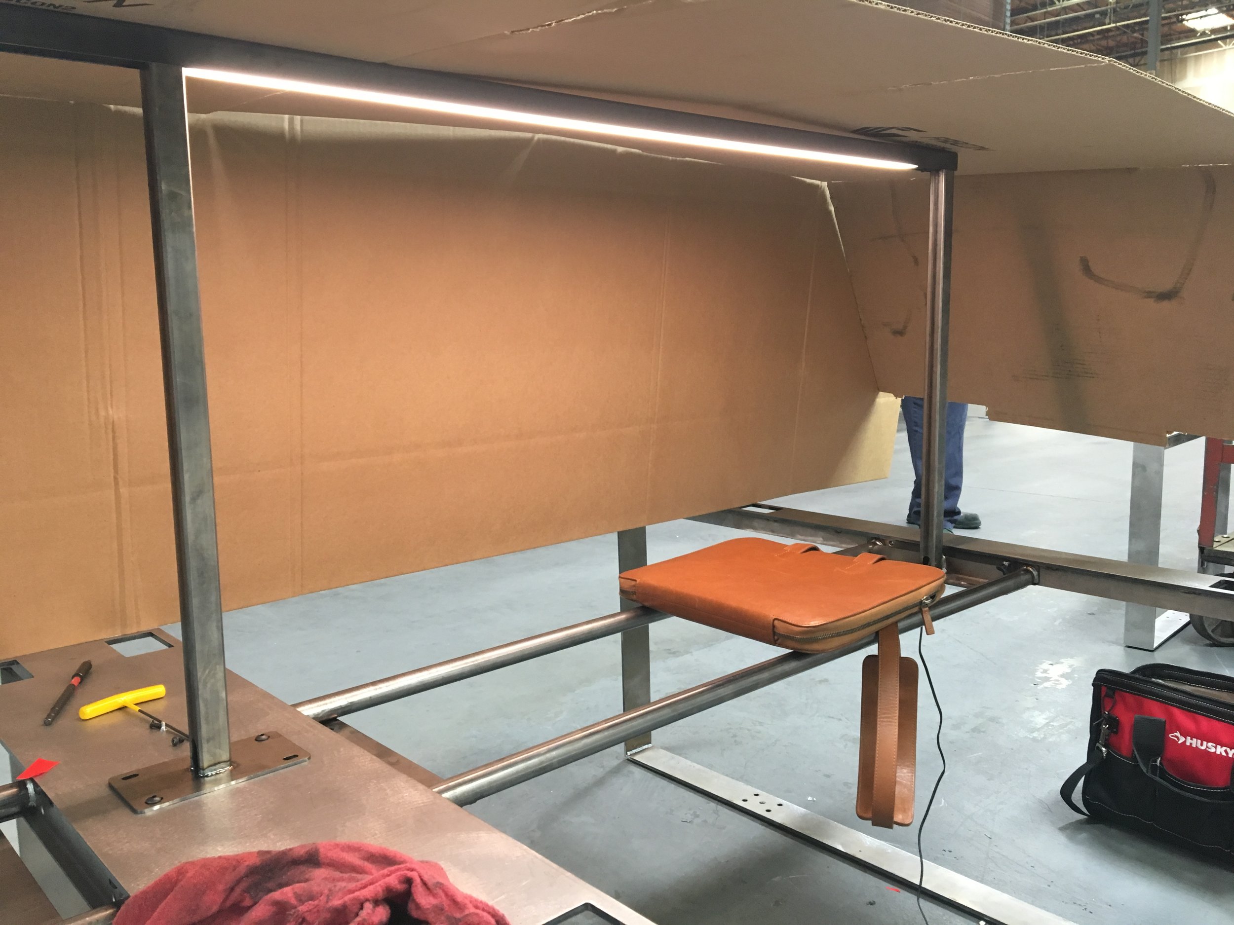
A crucial step in the design process was bringing our shared vision into the world, helped along by a little clever engineering work. As with so many Pair designs, the finished product looks clean and simple, but it’s a little more complicated under the hood. We tweaked the standard Mix power system, adjusting the power route to make the lighting we’d envisioned possible. This included building a minimal electric trough under the desks for user access, as well as sizing the posts holding up the light bars to house wires for the lights inside. We opted for a three-quarter-inch profile tube to allow threading of the wires while also maintaining a sleek profile. Everything cleverly plugs into Mix’s existing power beam that runs through the whole workstation system.
It’s All in the Details
Since user ease is a top priority for us, we also considered the ways in which employees would utilize their workstations to determine the best solution for power routing. We realized that granular control of the lights was key: that is, we wanted each person to be able to turn their light on and off from their desk, instead of getting up and walking to the end of a cluster to switch on a single light for the whole group. We also sourced LED light bars and customized their housing so a single bar could be easily removed and replaced. This was put to the test just a few weeks after install, when a light went out and we initiated a speedy replacement.
Going Dark
Finally, to match the minimalist and industrial look of the client’s space, we dipped into our rich palette of dark, moody colors. The Mix system itself was black, with details in ink and midnight matte and a warmer walnut veneer on the work surface itself. We went a different route with the light bar, deciding that the overall aesthetic would be best accented with the evocative raw metal appearance of hot-rolled, clear-coated steel.
Final material pallet for our custom Mix solution


