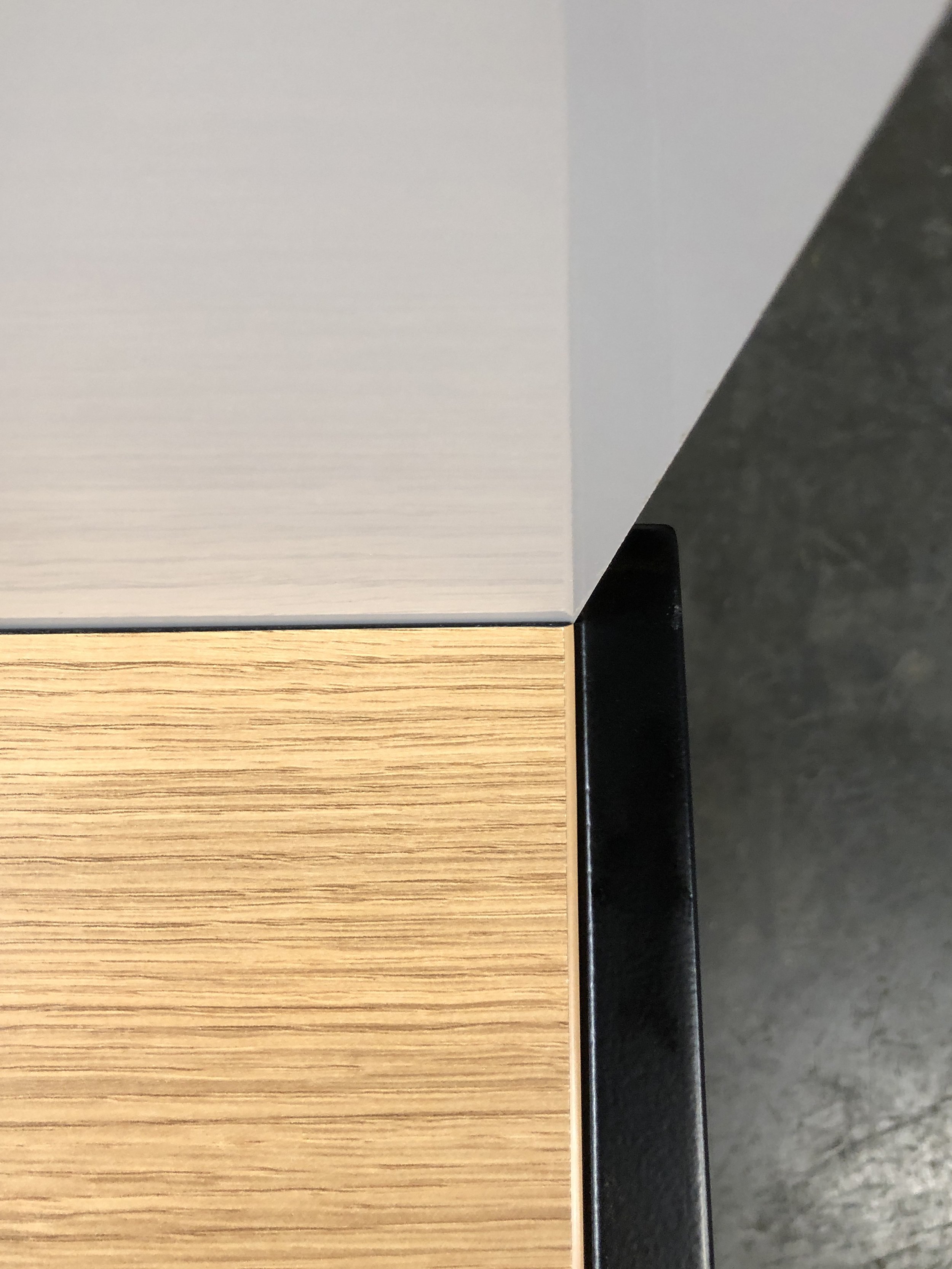
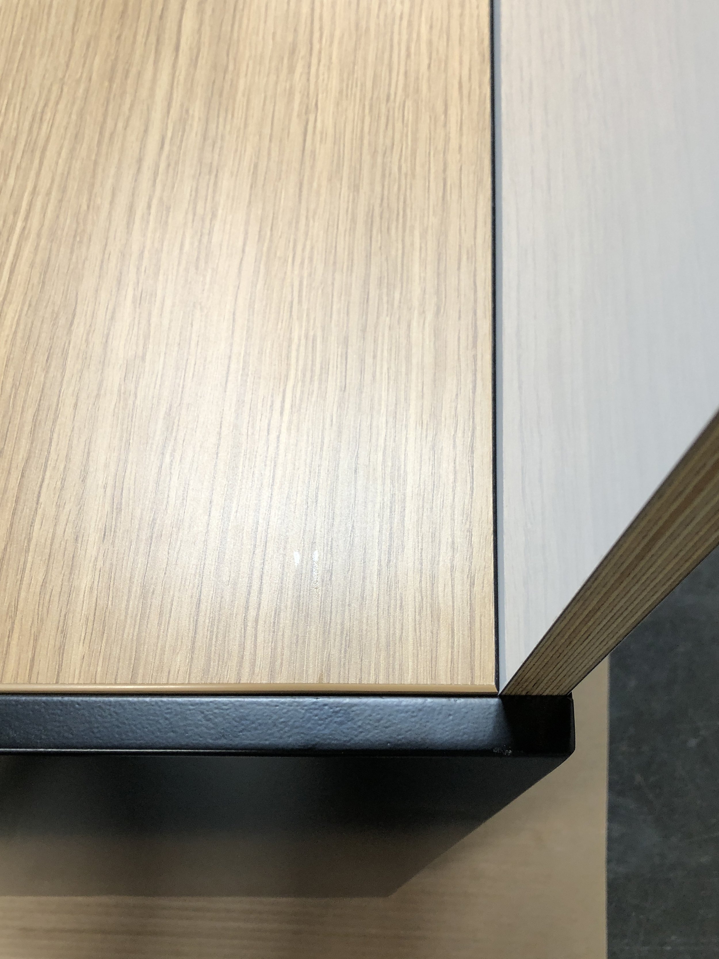
When Pair joined forces with a game company to create the perfect workspace for engineers, we knew it would be no ordinary project. Working with a game company presented us with an unusual set of challenges that we eagerly took on, moving forward with our characteristic process of client-focused collaborative design.
Some of these challenges were already familiar to us from working with other tech-focused companies. For instance, we knew we’d need to prioritize brainstorming spaces in our workstations, where engineers could write and visually problem-solve both alone and in larger groups. However, the client’s vision for these spaces was bigger—literally!—than any we’d encountered before. And one gaming-specific challenge was entirely new to us. The company’s engineers worked with multiple gaming systems in development, or dev kits, sometimes connecting with five or more simultaneously—all of which had to be able to run at once. We knew how to create workstations with the strength and cable capacity for heavy computers with serious processing power, but the dev kits took these constraints to a whole new level. We’d need to center the engineers’ high-performing hardware needs, taking storage, ventilation, power, and location into consideration. And, since we’re Pair, the aesthetics would have to be immaculate.
In the end, we designed, prototyped, and built four key custom details to meet this project’s very specific needs: whiteboards, ventilation, floating shelves, and power and cabling. To make sure each one optimized both functionality and appearance, we embarked on a collaborative design journey with the client, featuring frequent visits, substantial and productive back-and-forth, and even full-scale foam core models. Here, we’ll walk you through our steps, from our initial study through the process that ended with elegant solutions to all four of the project’s unique requirements.
Initiating a collaborative design process with our client
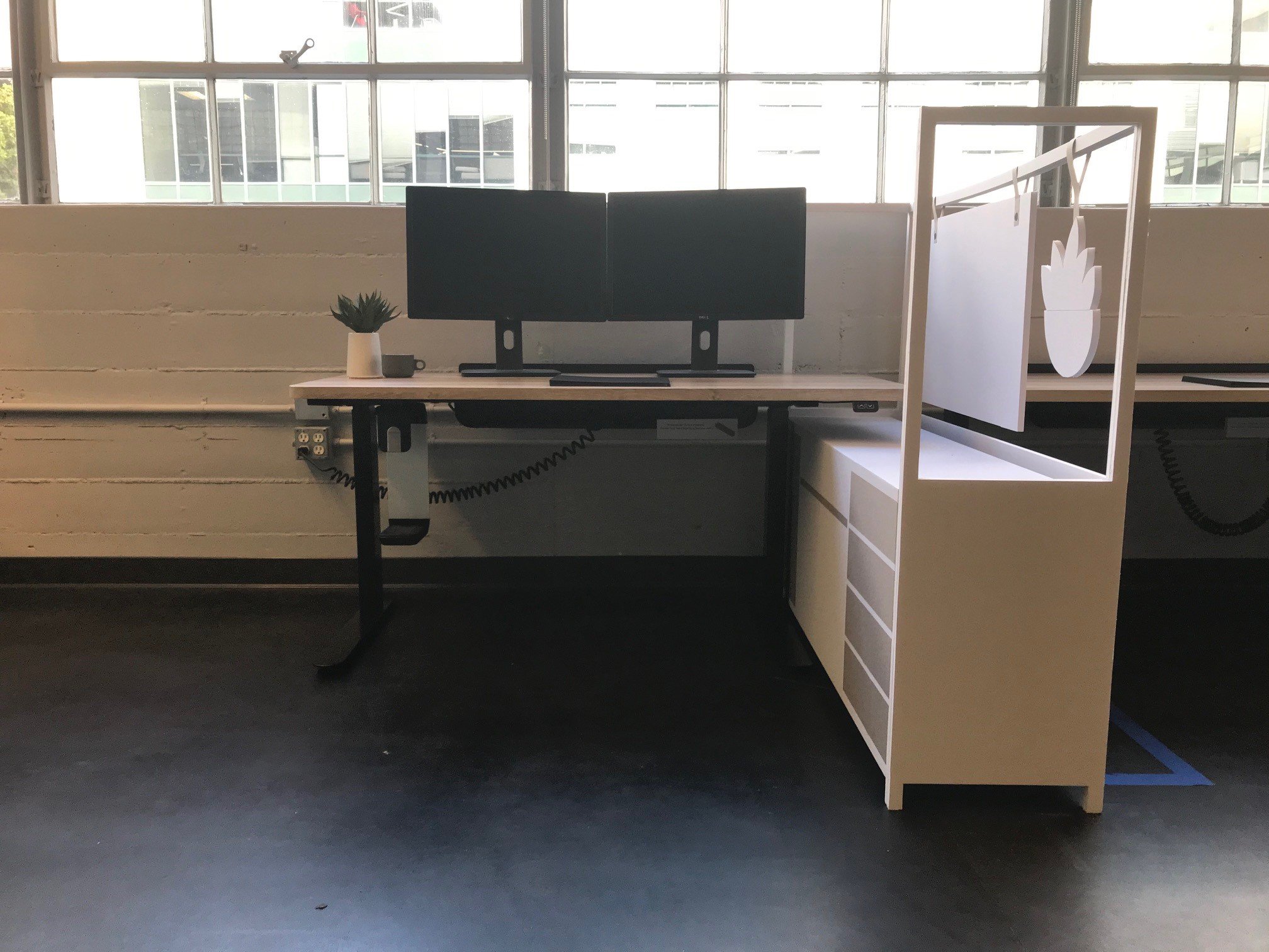
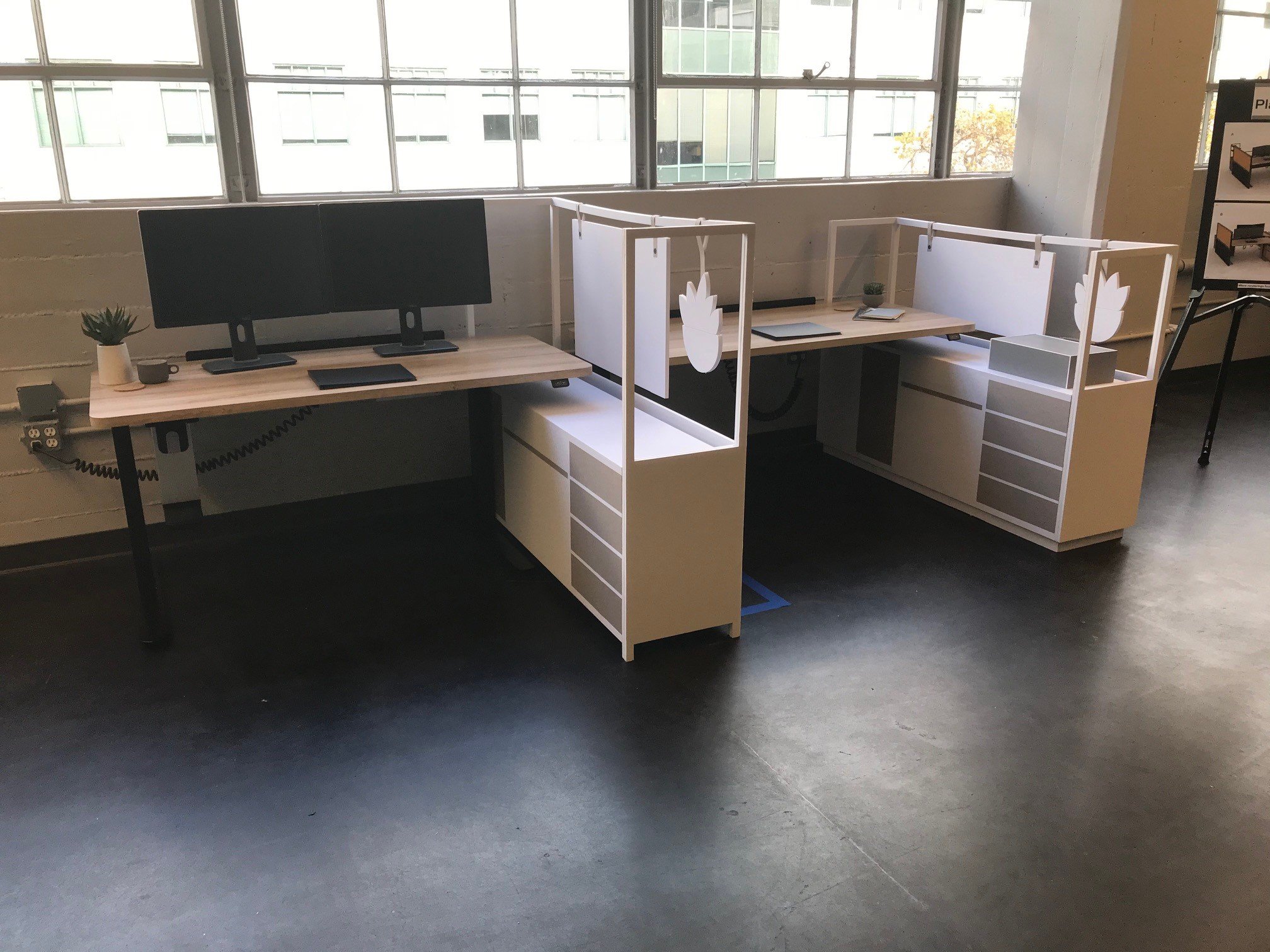
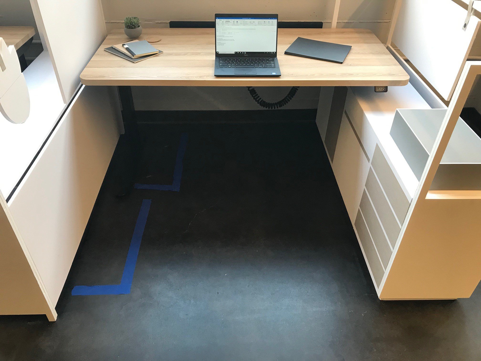
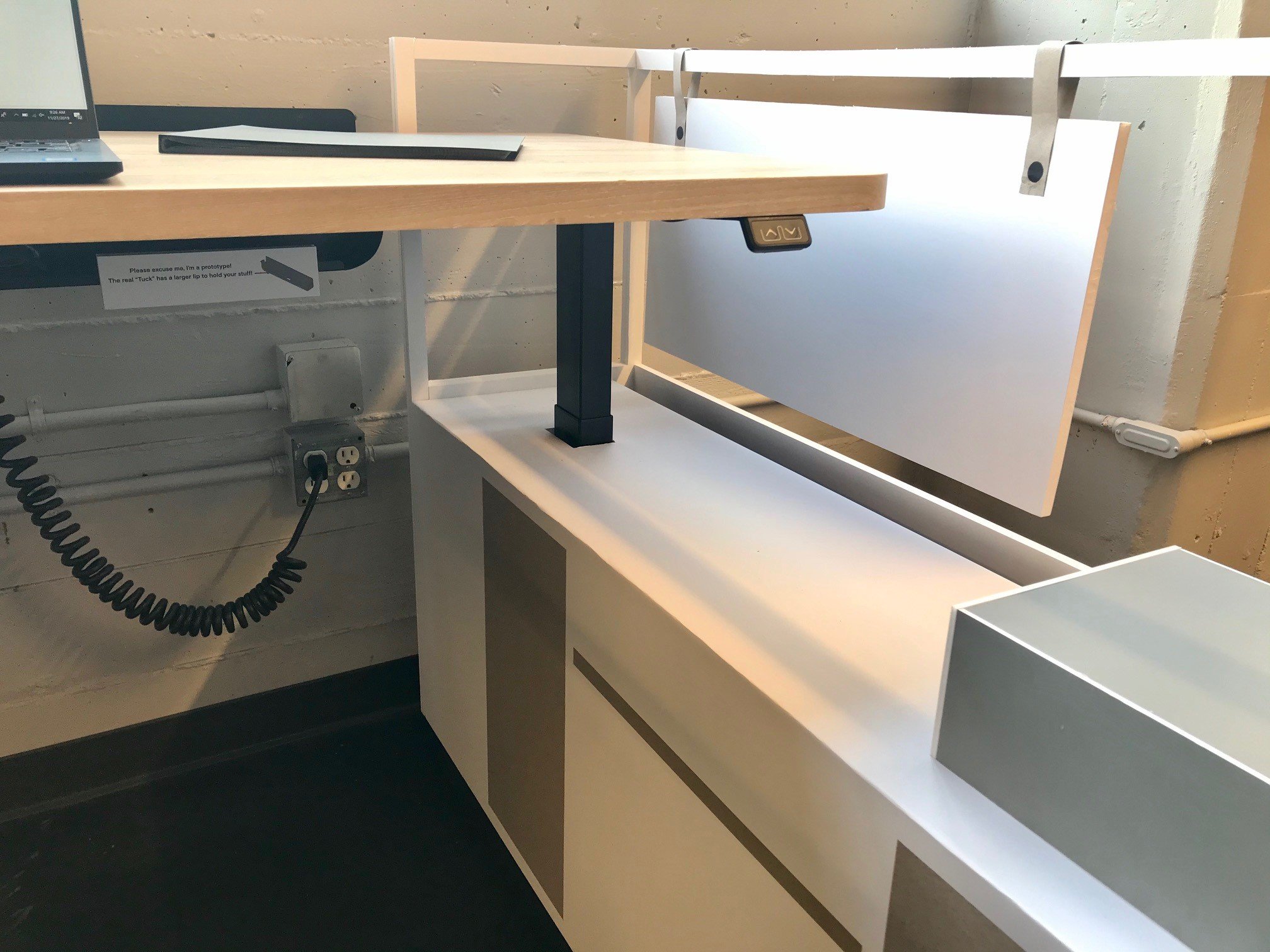
Instead of relying on abstract images and sketches, we at Pair wanted to bring our vision for the new workstations vividly to life. That way, our clients could instantly visualize our initial conception of the space and work with us to refine it. To achieve this, we built a mockup in the client’s existing offices, taking a height-adjustable workstation as a base and creating foam core models for the rest of the details. Using foam core for this volume study stage meant we could explore shape, form, height, and size on the fly, moving with agility between different possible configurations.
Once we’d agreed on an arrangement based on the foam core models, we jumped over to an actual build for a system of four workstations, using metal and a framed whiteboard as our materials. This gave our client a chance to conceptualize the workstation design with a fresh sense of its presence in the space. It also meant another chance for feedback and collaborative design. Per Pair designers Hillary Kalamaha and Elliot Whalen, “This project in particular, more than any other project, was like a three-phase product development. We got to review each step with our client to really, ultimately get to the end design that they like.”
The client scoped out our first version of the build and decided it relied too much on metal. They wanted to keep pushing the look further, and they felt its functionality could be improved. In response, our second round of design work focused on maximizing whiteboard space, beyond what we’d ever seen in existing workstations.
Developing a Floor-length Whiteboard
Our initial whiteboard idea came about as a solution to a typical ask from an engineering team: optimized vertical space at each desk. Our client’s engineering team needed spaces that transcended normal solo desks, featuring large whiteboard surfaces for both group and independent idea generating. To meet this need, our first build included a two-sided whiteboard within a frame to help maximize note-taking space, facing each user and their neighbor.
When the client came back to us after our first build, they asked us a simple, game-changing question: could they have a whiteboard on everything? We tackled this request full-on, moving from a framed whiteboard to a larger one, and finally designing a whiteboard for each workstation that went all the way to the floor on one side. This major shift in the concept for the space increased the day-to-day functionality for the client, literally making room for engineer creativity. It also brought in its own new design requirements, which significantly shaped both the materials and appearance of the final product.
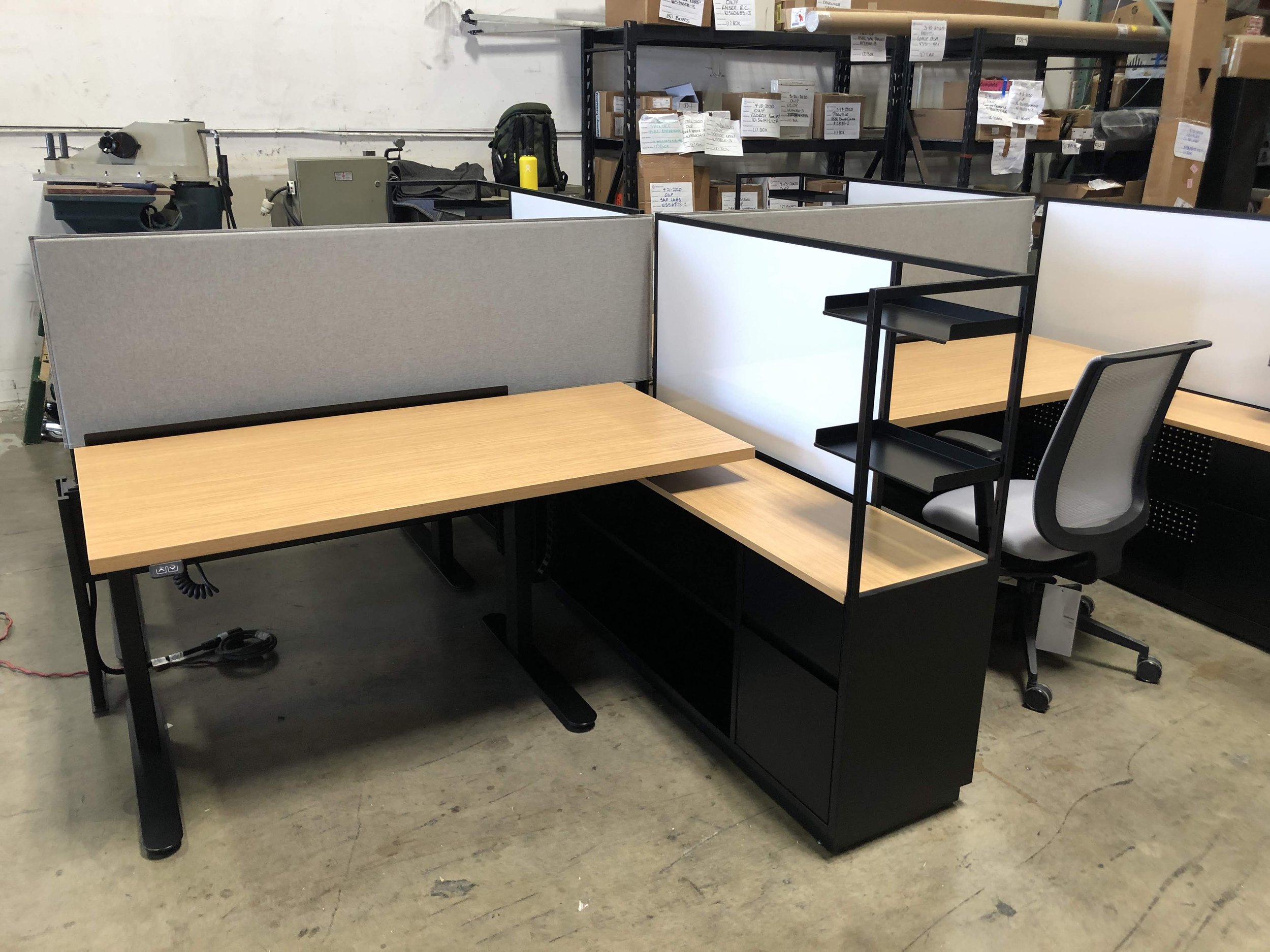
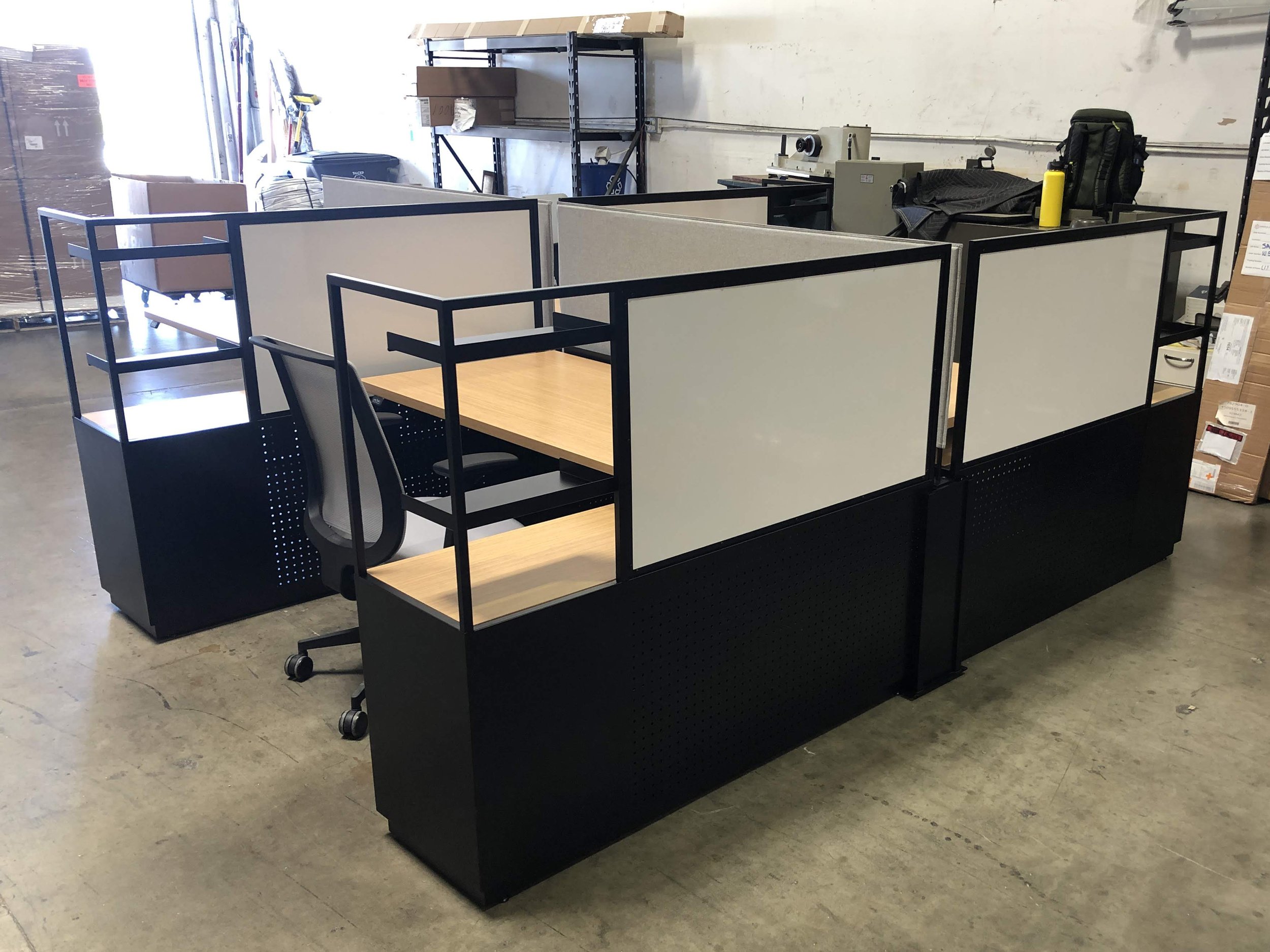
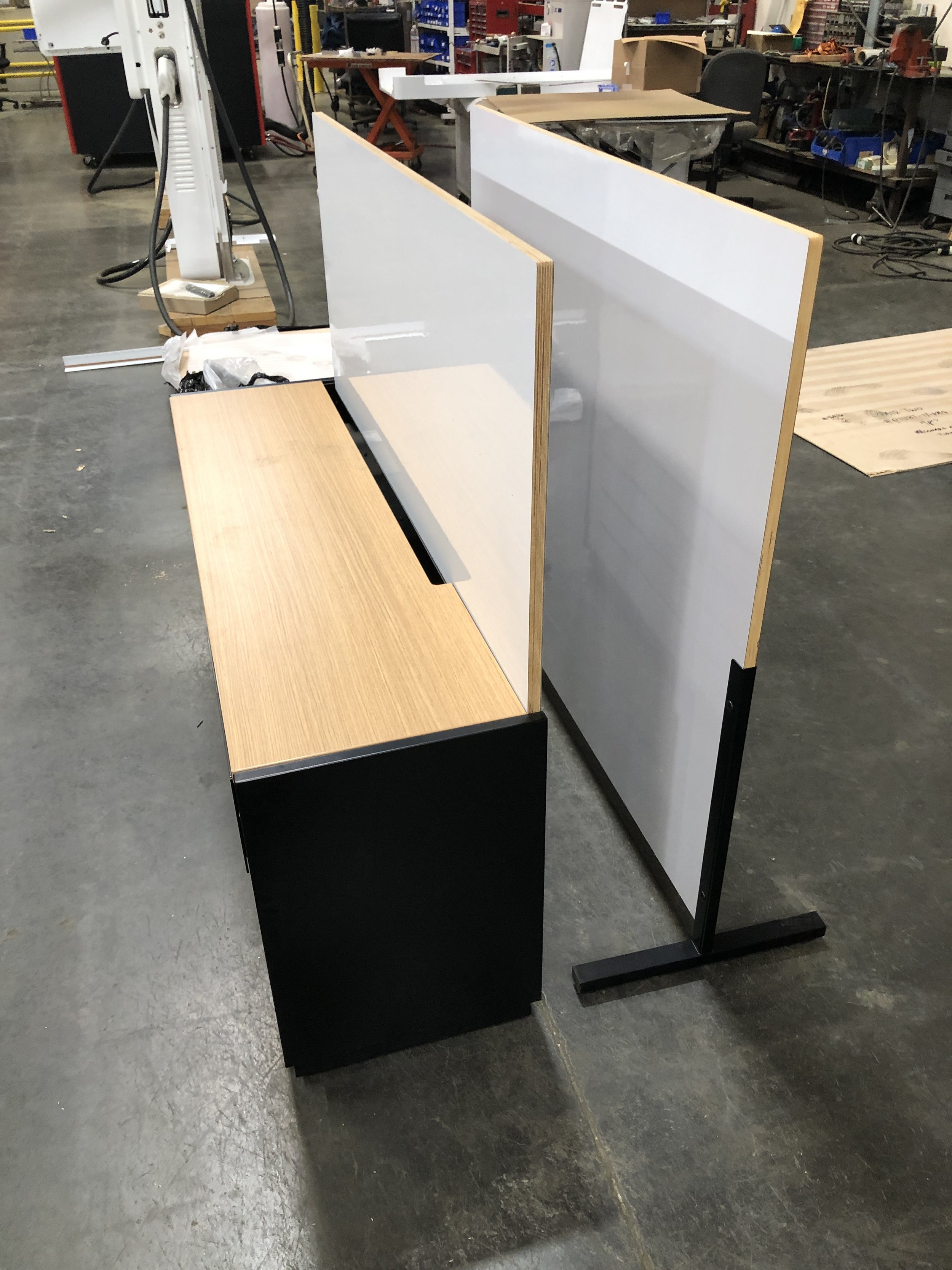
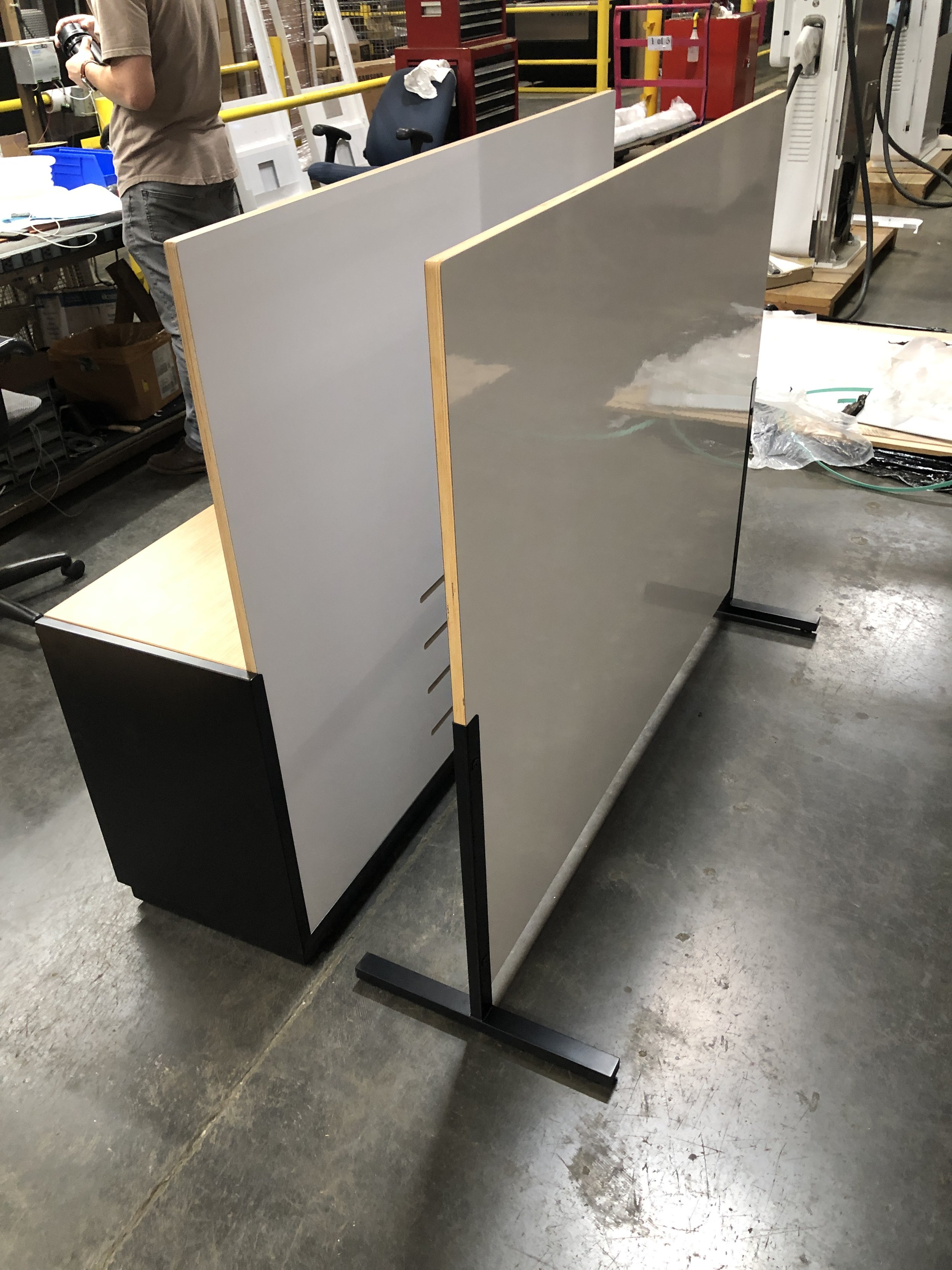
For our first build, we’d considered sharing parts between workstations. However, the new concept of floor-length whiteboards pushed us into developing fully independent credenza-like units at the side of each desk, where the boards could easily be mounted. Due to the simplicity of this whiteboard-as-divider design, we were also able to remove the tubes and mounting pieces that had been part of the original metal design, creating an even sleeker build. Finally, since the whiteboards would be functioning as the backs of the credenza cabinets that housed the dev kits, we needed to revisit an essential aspect of the design for any tech-heavy workstation: ventilation.
Designing Seamless Ventilation for Powerful Dev Kits
Given the many gaming dev kits each engineer would need to be able to run simultaneously, we knew from the outset that ventilation would be an essential concern. Any design involving computer hardware needs to consider not just storage space and equipment arrangement, but also ventilation, the key ingredient for keeping hardware cool and working optimally. To meet this need, our first build used perforated metal for venting. This had the advantage of flexibility: if we had a specific vision for the shape, we could create our own patterns using lasers, and if we decided on a look that was less distinctive, we could opt to work from cheaper sheet metal parts with pre-existing patterns to reduce client costs. However, once we and our client decided to go with whiteboards instead of metal dividers, we needed a new approach, one that integrated ventilation into the whiteboard itself.
We looked at other products on the market to get a sense of existing solutions. How much ventilation did they include? How large were the openings, and how many were there? How would the amount and size of the hardware impact the airflow? Once we had an idea of what adequate ventilation would look like, we created multiple visual studies for our clients to nail down the aesthetics. We started with three ventilation slots, then moved to five, finally mutually settling on a balanced, attractive four slots.
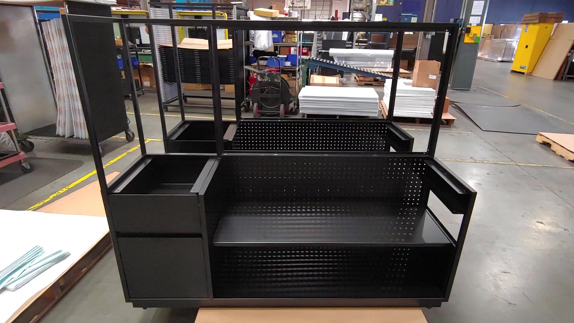
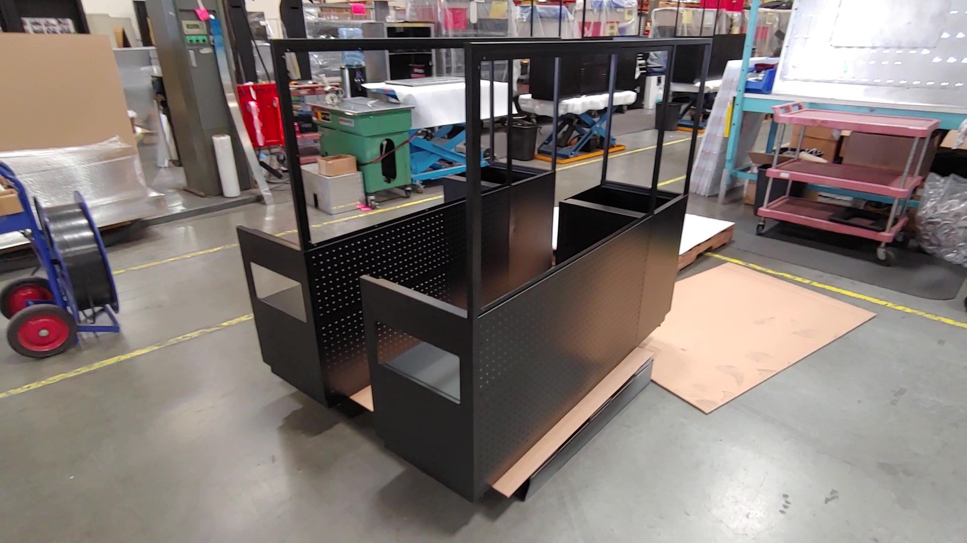
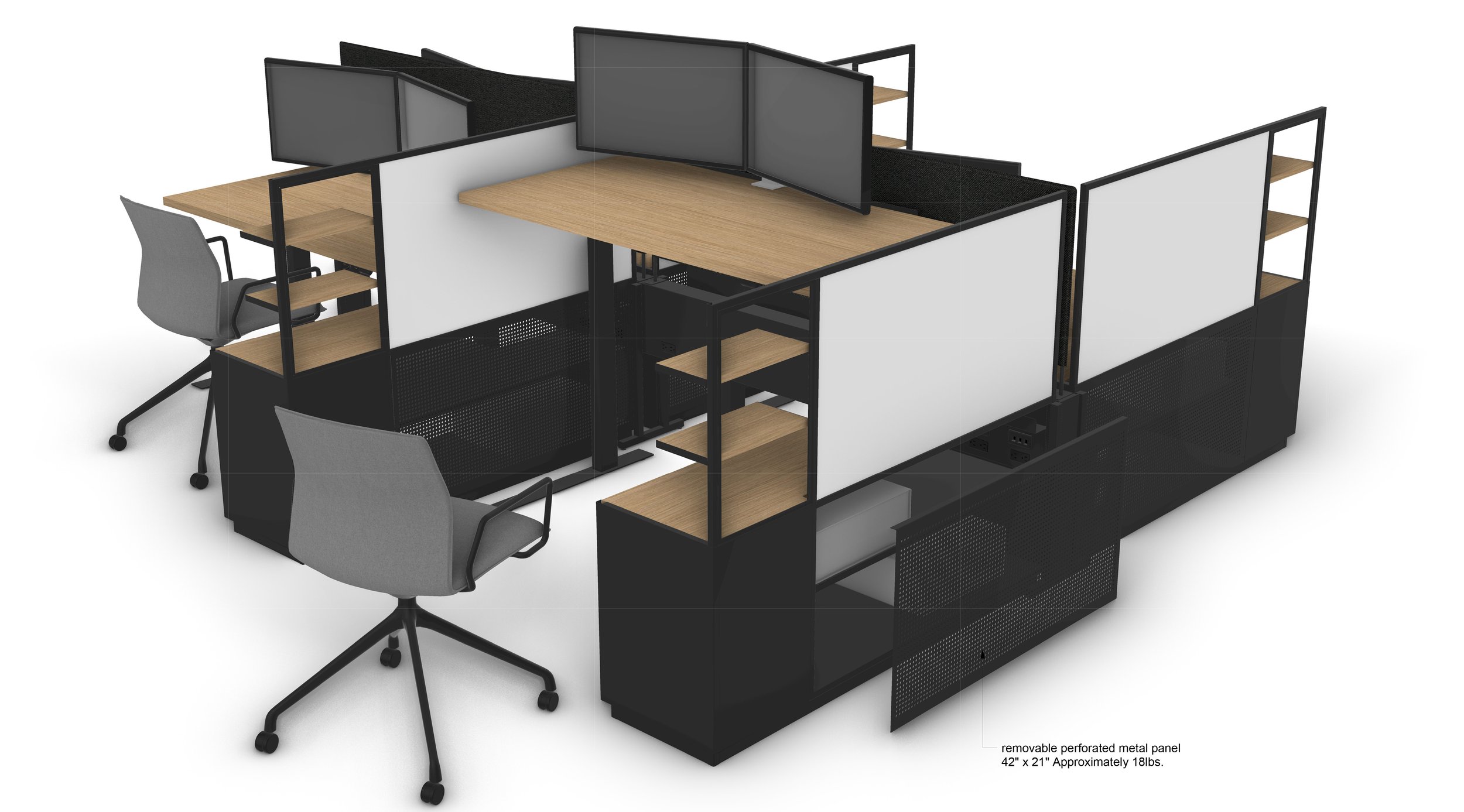
Photo: Jason O'Rear
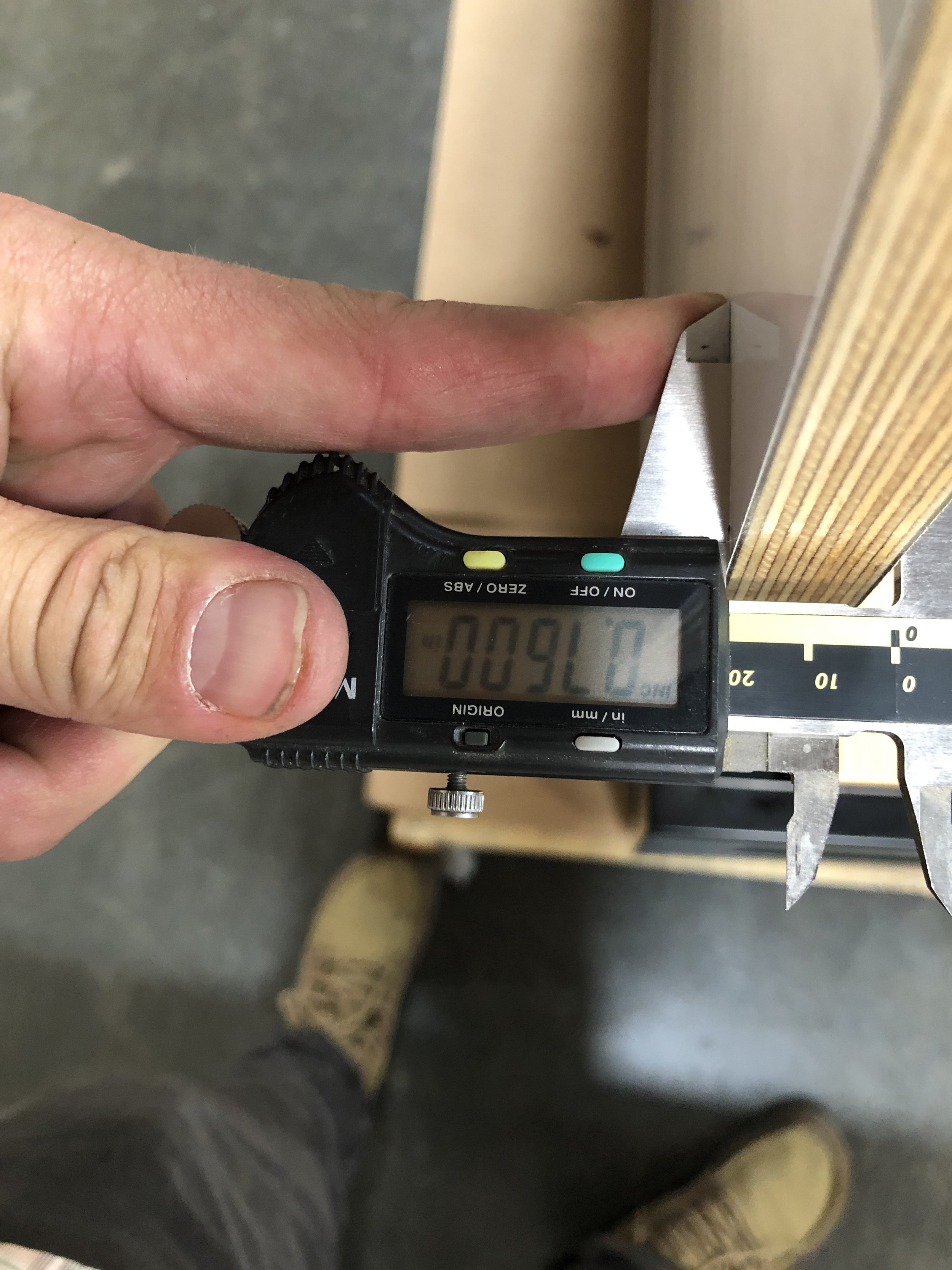
Our ventilation solution impacted our materials choice, too. We’d planned at first on using a particleboard core for the whiteboards. However, now that the whiteboards would need grooves routed into them for venting, we knew that particleboard wasn’t going to give us the clean look we wanted for the edges of the slots. Instead, we opted for a core of Baltic birch, whose details and edges would look sleek without painting or difficult edge-banding. As Pair designers Hillary Kalamaha and Elliot Whalen described, “It's a very simple move with minimal finishing work at the end. It wasn't the original ask, but we think it came out great, because we eventually got there through back and forth between us and the client.” By fully embracing our client’s preference on the whiteboard and using it to guide our development of related details, we’d achieved a solution our client loved—one that would’ve been impossible if we’d insisted on sticking to our initial vision.
Constructing a Simple Floating Shelf
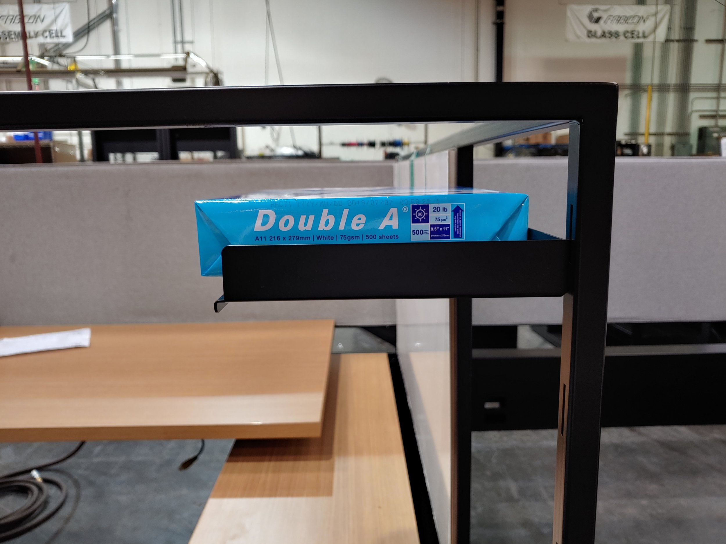
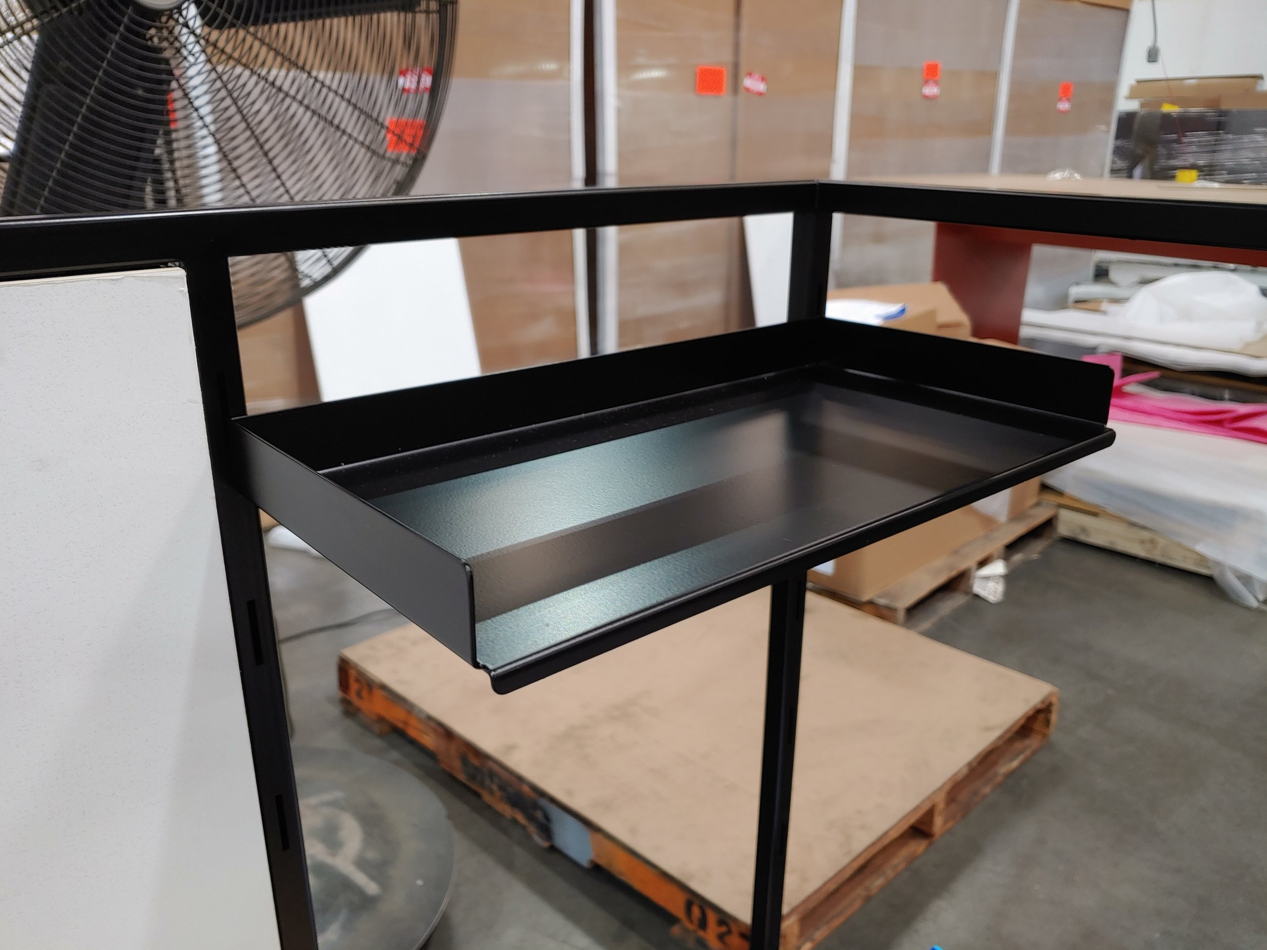
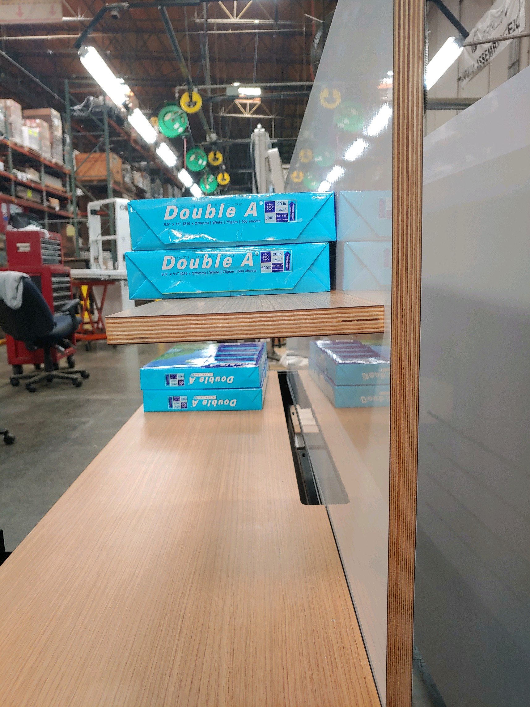
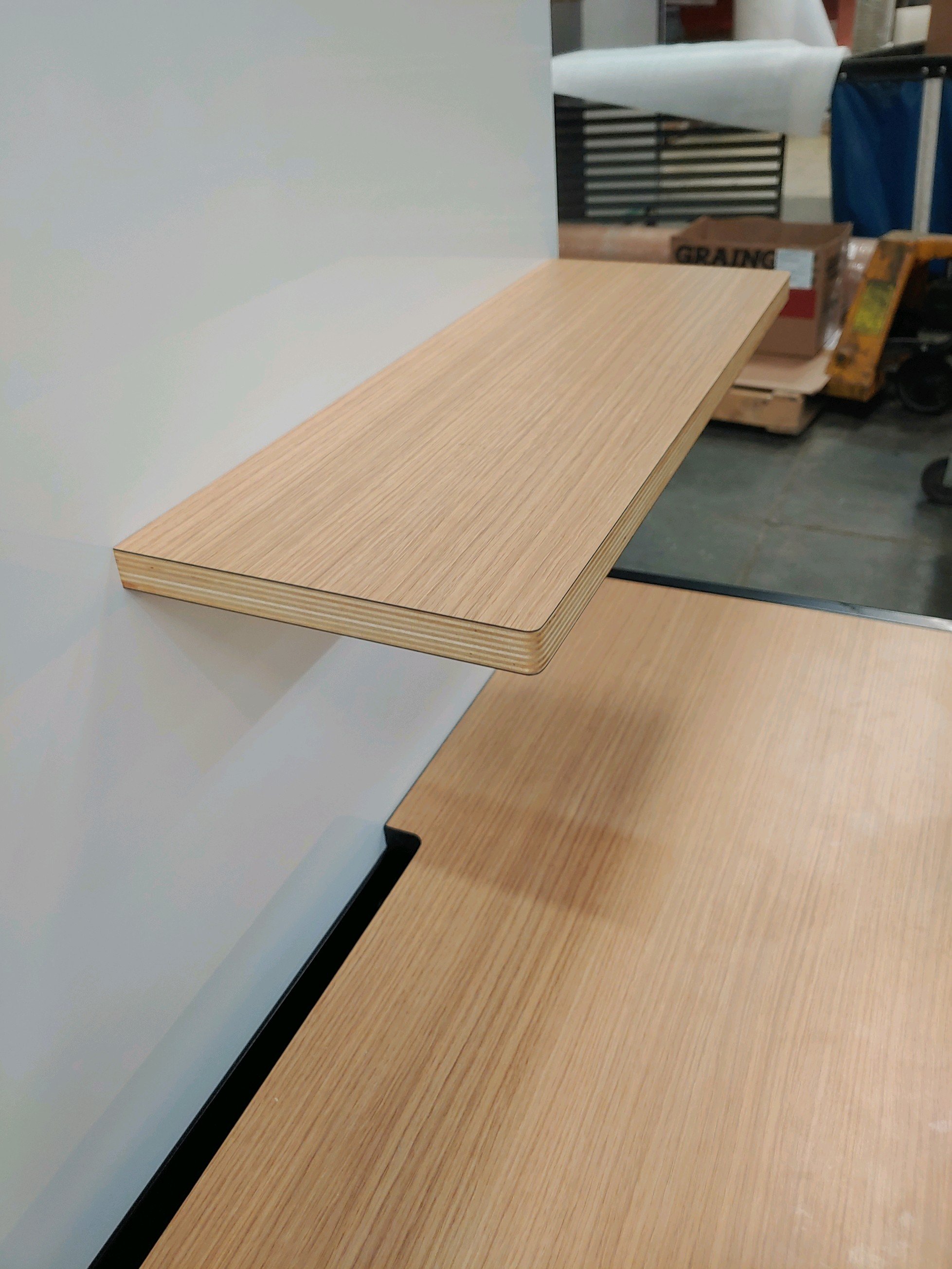
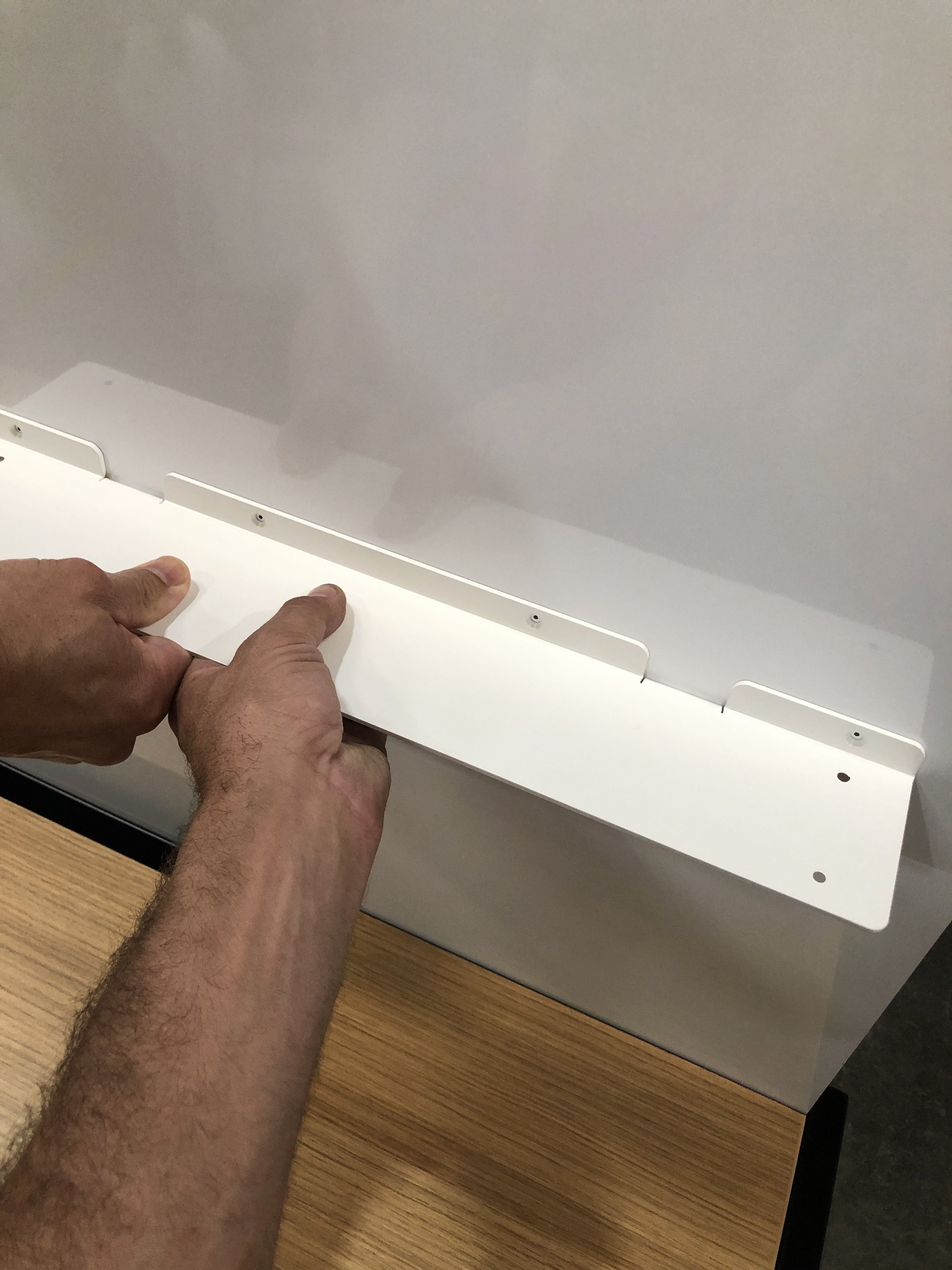
With feedback from our client, we carefully designed and tested versions of the shelf until we’d developed one that could be mounted securely onto the whiteboard, while still providing enough support for multiple heavy paper reams. And to make the shelf look consistent with the workstation as a whole, we came up with a way to echo two visual details from the rest of the design in its materials. We opted to use the same laminate finish for the surface of the shelf that we’d chosen for the desktop, while also building in a core that provided the same birch side reveal the whiteboard incorporated. With this choice, we were able to meet the client’s needs for the shelf’s position and sturdiness while also ensuring it visually blended in from both the front and side views.
Integrating Power and Cabling
At Pair, we’re old hands at crafting functional, aesthetically sleek arrangements for workstation power sources and cables. We were excited to bring these skills to the table to meet a new challenge: powering not just computers, but multiple dev kits, too, which would be housed in separate areas within each workstation. We based our design around a power beam that would be threaded invisibly under the dividers between the workstations, providing each engineer with easy-to-reach access to power for both the computer and the credenza cabinet storing the dev kits.
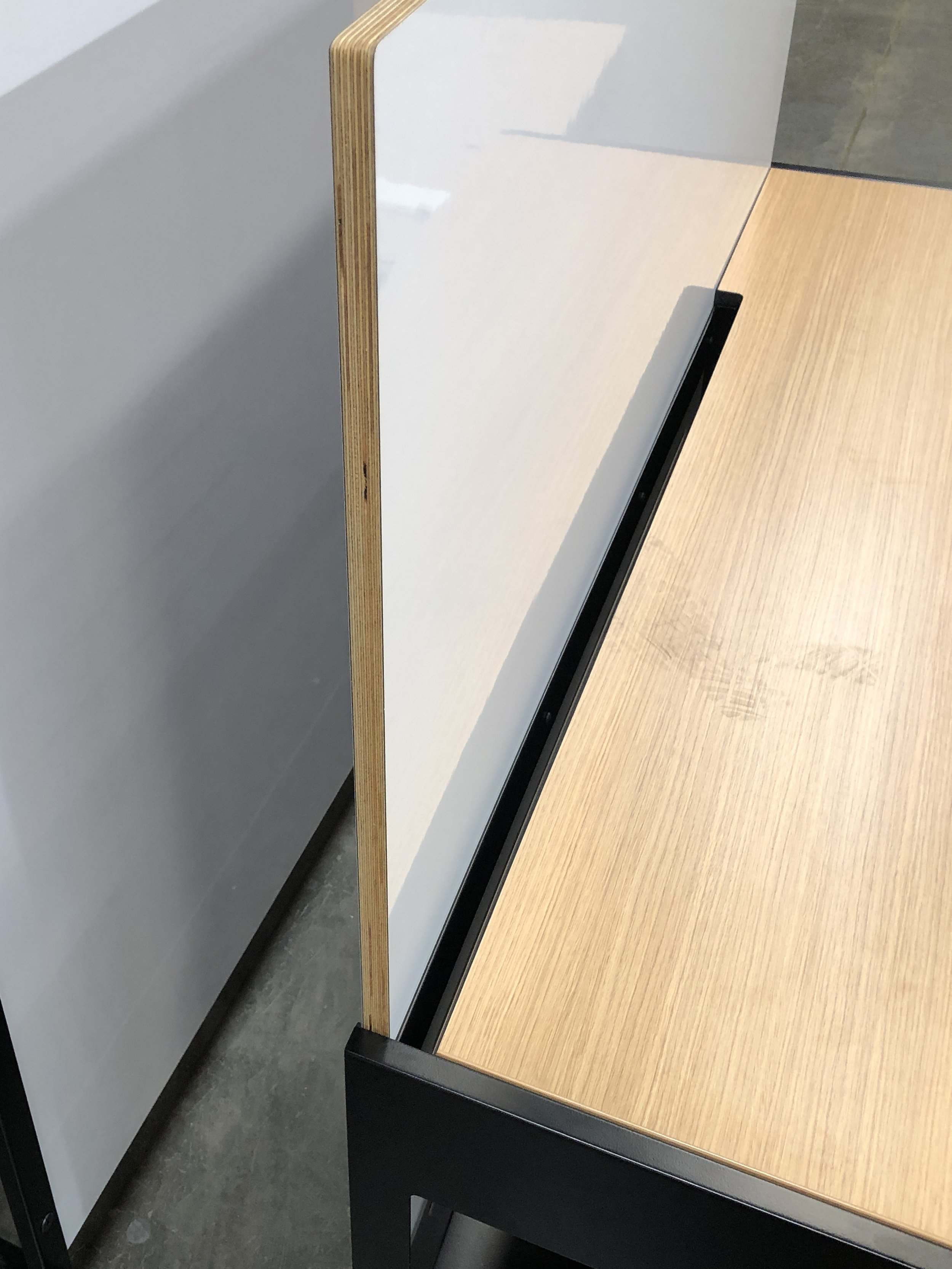

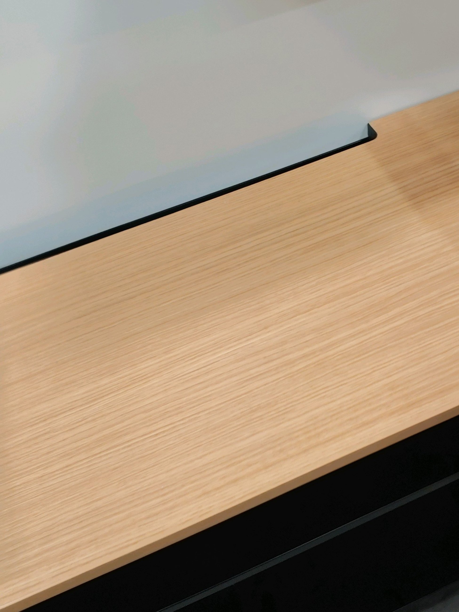
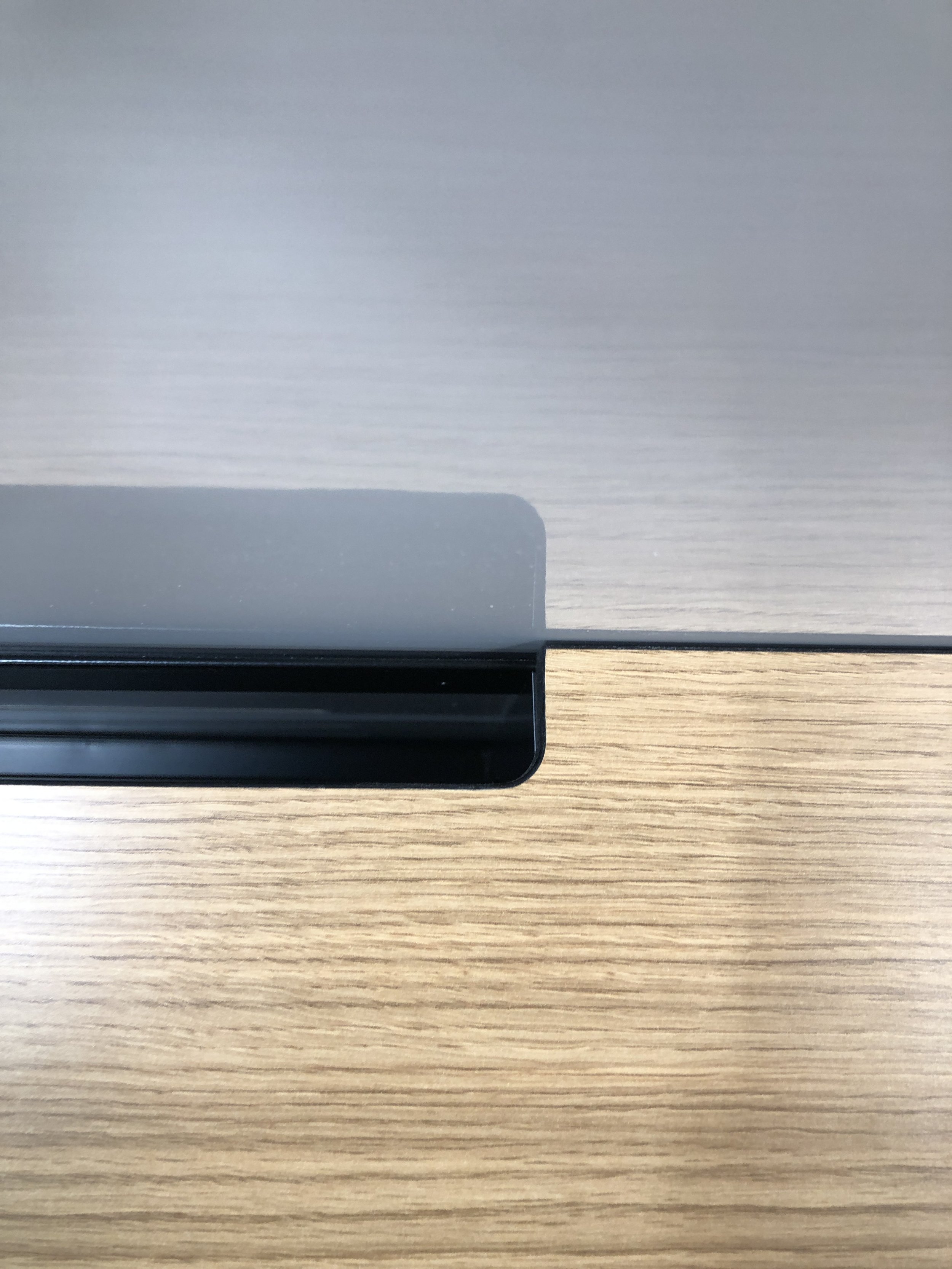
But what if an engineer needed to work directly with one or more of the dev kits, instead of keeping them stowed away? Wouldn’t it make things simpler if a dev kit or two could be set up on the surface of the workstation? To increase the range of possible hardware arrangements, we needed to add a little something extra. We came up with a deceptively simple idea: a cut-out along the back of the credenza cabinet’s top. With this addition, dev kits could sit on the cabinet tops with their cords neatly filtered down into the main cabinet, allowing them to plug directly into the beam without being draped across the work surface. As a bonus, the cut-out would provide the dev kits below with extra ventilation. To finish the look, we smoothed the edge of the cut-out and painted it black. According to our designers, “Really small details were taken into consideration during this, like all projects. But because we were working on it for so long, we had the time to go back and revisit many things, to either improve on or modify the fit the end users asked for.”
A Reflection on the Design Process
From the very first stage of developing this workstation design for our game company client, we knew the engineering team’s special requirements for the space would be our central consideration, with the overall design falling into place around them. We also anticipated that by ensuring space for fruitful back-and-forth with our client at every step of the process, we’d be able to fulfill that primary need, through mutually ideating the design innovations it demanded. As our designers say, what made this process one-of-a-kind was “that evolution of design and engineering—and also, what the client was really asking for came together in the end.” With its four custom features that achieve both function and aesthetic unity, we feel our final product represents another successful demonstration of the collaborative, client-facing process and out-of-the-box design thinking that Pair is known for.
Photo: Jason O'Rear
More from Pair Love
The making of miniature Olli(s)
Behind Pair
Visions on space division for the workplace


